Branding & Identity
A strong visual identity is more than just a logo—it includes colors, typefaces, imagery, and overall style that create a cohesive and memorable presence. A well-designed visual identity communicates your brand’s personality and ensures consistency across all platforms, from business cards to your website. It connects with your audience on an emotional level and fosters trust. My branding packages include a custom logo, a tailored color palette, typeface pairings, design guidelines, and custom illustrations and patterns to help your brand connect in meaningful ways.
The Springs Microgreens
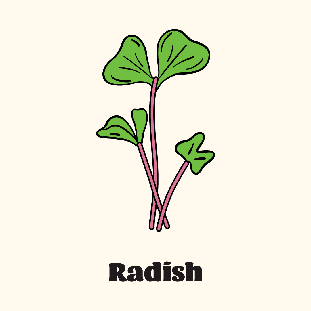
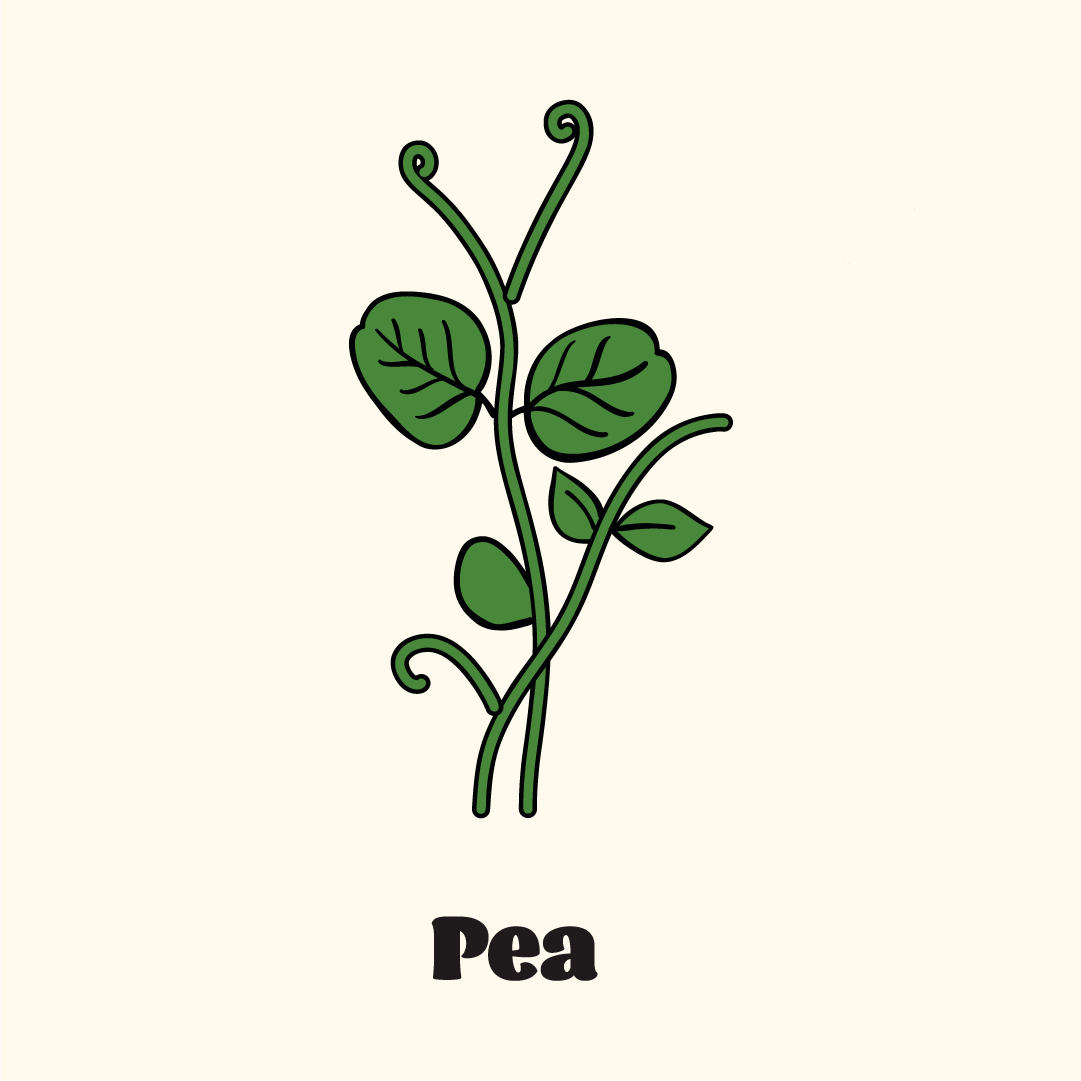
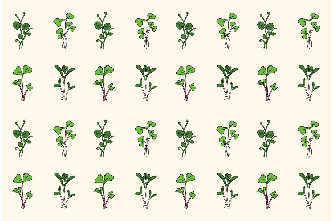
For The Springs Microgreens, I created a branding package that showcases the vibrant nature of their products. The design features custom illustrations of four key microgreens – radish, pea, broccoli, and cilantro. I used these microgreens to create versatile patterns that enhance the brand's visual appeal. Earthy, natural tones give the brand a grounded, fresh feel, while a friendly, approachable typeface adds warmth and personality. This identity captures the essence of their microgreens, giving the brand a fresh and inviting feel across packaging, signage, and promotional materials. I provided all the branded materials and assets they need to build their website and marketing collateral, ensuring they can maintain a consistent and professional presence as they grow their business.
Product Packaging
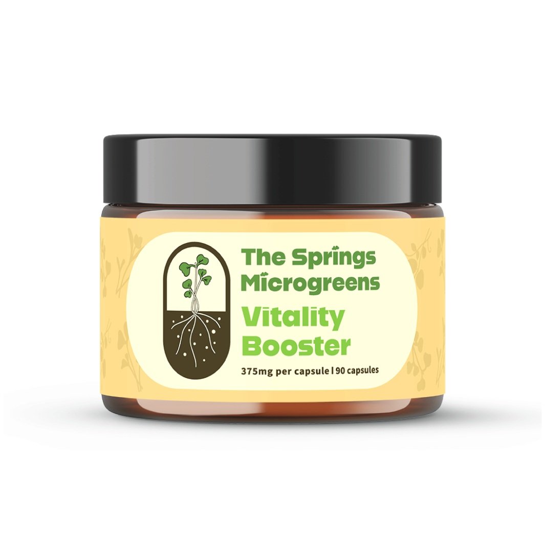
The Springs Microgreens had a general vision for their packaging: something fresh, modern, and rooted in the vibrant energy of their brand. To start, I incorporated a soft microgreen pattern in the background, adding subtle texture without overwhelming the design. I also carried their capsule shape theme throughout the layout to create a cohesive look. Additionally, I used the bright, fresh greens of their brand to ensure the packaging feels lively and inviting.
Beyond aesthetics, I made sure all labels met compliance standards while maintaining a clean and approachable design. To enhance usability, I included a QR code that makes it easy for customers to navigate directly to their website.
The result is packaging that is not only visually stunning but also practical and aligned with The Springs Microgreens’ vision. Check out the final design below!
Jojo’s Apothecary
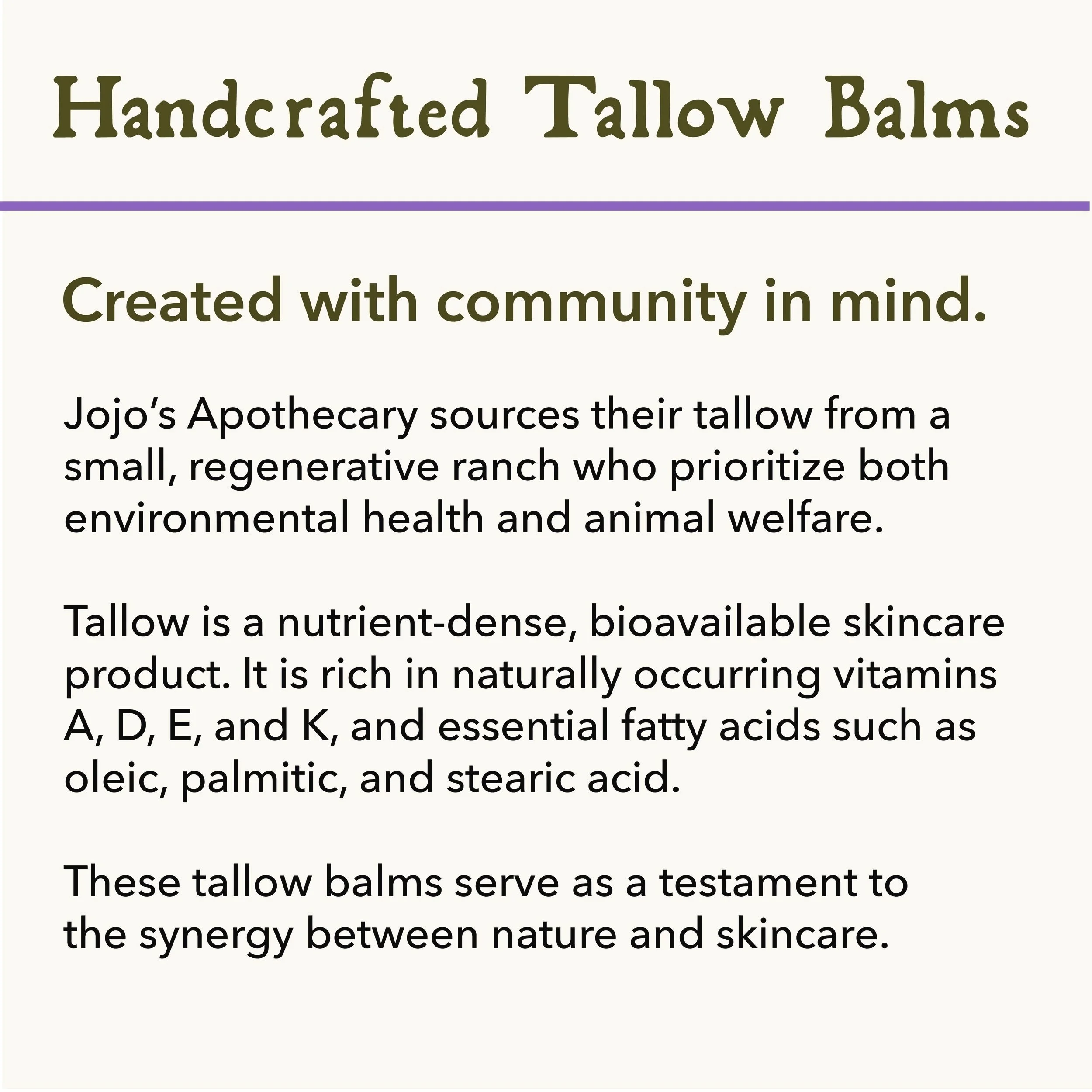
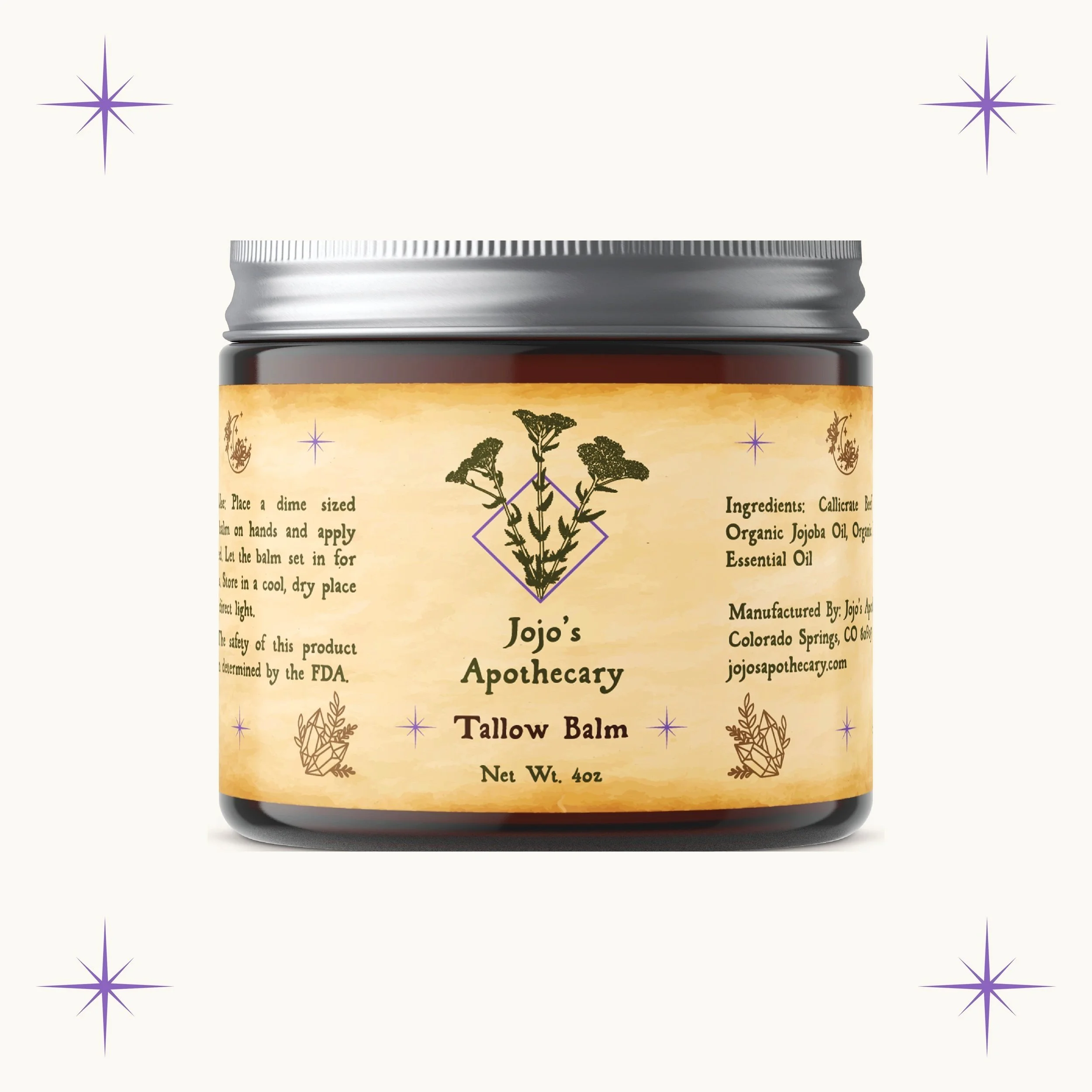
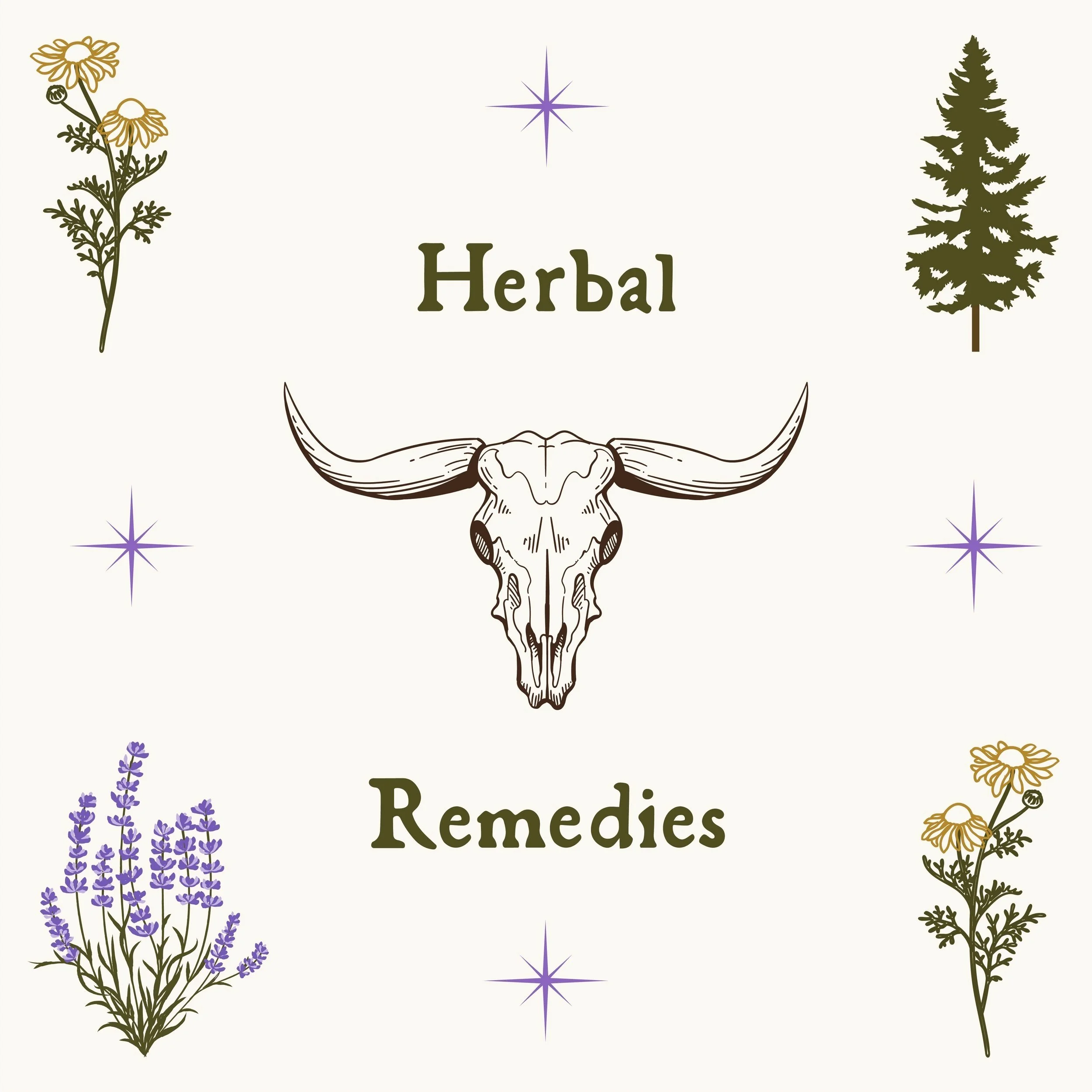
Jojo’s Apothecary creates nourishing tallow balms by blending hand-rendered tallow with soothing essential oils. Joanna brings her knowledge from her butchering experience to select the best tallow and rendering method. For this brand, we focused on more old-school, mystical apothecary themes. A custom typeface achieves this look, while herbal illustrations tie the brand together in icons and patterns. Her logo highlights the plant yarrow, known to be a powerful medicinal herb and plant ally. We worked in soft purples, deep greens, and golds to evoke a sense of natural elegance. I also designed her website, which can be visited at the link below! It’s been a joy to bring Jojo’s Apothecary to life!

Product Packaging
Jojo’s Apothecary wanted a vintage apothecary vibe with a hint of magic. To achieve this, I used a burnt paper background for an aged look and paired it with a vintage typeface to evoke the feel of an old apothecary journal. Sparkles added an enchanting touch, while herbal illustrations highlight the plants she uses in her remedies. I also designed cohesive top labels for each blend, tying everything together. The result is a vintage yet magical design, with unique details that make each label special.

